Working on Offener Kreis
Documenting the process behind the reflection card set Offener Kreis. From research and question curation to structure, design exploration, and production considerations.
Working on Offener Kreis
Over the past weeks, I’ve been working on a reflection card set called Offener Kreis.
There is still no finished artifact. No printed deck. But a lot of decisions have been made.
This post is mainly a record of that process.
Starting with content
The first phase was not visual at all.
I spent quite some time reading and revisiting sources on participatory research and citizen science. I wanted the questions to be grounded, not just generically reflective, but connected to real tensions that occur in collaborative research settings.
With the help of NotebookLM, I generated a large pool of raw questions. The output was extensive, more than I could realistically use.
From there, the real work started: Multiple rounds of going through the questions, removing, merging, sharpening. Some were too specific. Others too vague. Some sounded clever but did not open anything.
In parallel, I used ChatGPT to reformulate selected questions. The goal was not to make them “smarter,” but more open and less evaluative, more invitational.
Structuring the set
Once the questions felt coherent, I began structuring them along two dimensions:
- Project phase
- What I initially called “tensions” and later renamed to “orientation”
The second term changed the tone significantly. “Tension” implies conflict. “Orientation” leaves more room for positioning.
This two-dimensional structure became the backbone of the set. It also made visible where I had too many questions and where gaps existed.
Visual exploration
Only then did I start experimenting with visual form.
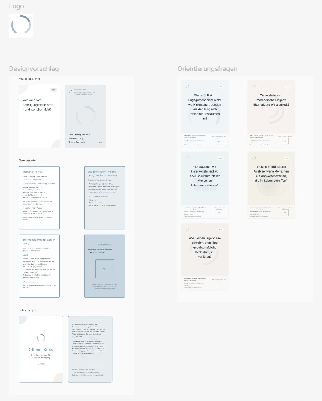
Using Figma Make, I explored different layouts and styles. Typography combinations, color systems, icon ideas for the two dimensions.
I also set up a lab page as a product and usage page for the card set.
At that point, I was honestly quite satisfied. The designs looked clean, coherent, and usable.
External perspective
Still, I decided to look for a professional designer, partly out of curiosity, partly because I wasn’t sure whether I was missing something fundamental.
After navigating the university’s procurement rules and searching for a designer, I started working with Daniel Marks.
Our first conversation shifted the frame.
He immediately focused on typography: not as decoration, but as structure. He asked how the visual system could make the two dimensions (phase and orientation) legible without relying on explanation. He suggested printing drafts at actual size to test readability and hierarchy.
It sounds obvious in retrospect. I hadn’t done it.
Up to that point, I had solely worked on screen.
The feedback did not invalidate what I had done. But it made clear that what I had considered “design” was still mostly arrangement.
Material considerations
Since then, the project has grown to include things I hadn’t considered at first:
- card size and handling
- print readability
- hierarchy at actual scale
- symbol language
- production options
I also started researching online printing services and was pleasantly surprised by how many offer small-batch card production.
The project now feels less like a conceptual exercise and more like something that might physically exist.
Current status
Right now:
- the question pool is stable
- the two-dimensional system holds
- the visual language is being reworked more deliberately
- production seems feasible
The card set does not exist yet. Right now, it’s mainly the structure, decisions, and a clearer path forward.
Still, I’m happy with what’s been achieved so far, and I’ve learned a lot about what it takes to move project ideas like this toward implementation.
Found this useful? Leave a signal.
Note on authorship: This text was developed with the support of AI tools, used for drafting and refinement. Responsibility for content, structure, and conclusions remains with the author.